מיתוג > Horizon Capital
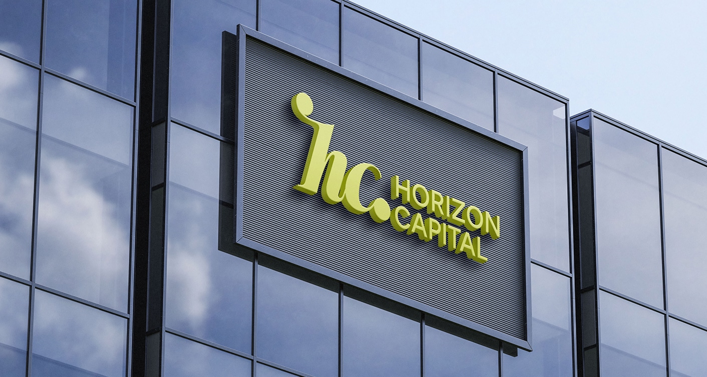
מאסטרים בניווט הצמיחה
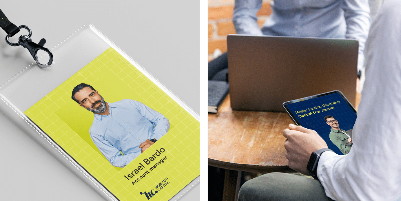
קרן הון סיכון עתירת הצלחות פנתה אלינו עם מיקוד ברור: ללוות חברות בדיוק בשלב הקריטי שבין סבב גיוס ראשון לשני. בשונה מקרנות מסורתיות, Horizon פיתחה שיטה ייחודית, ליווי שבועי צמוד, מנטורינג שוטף ותמיכה שיטתית שמסייעת לסטארטאפים לצמוח נכון. הם חיפשו מותג שישקף גם את הרקורד המרשים שלהם, וגם את השיטה המדויקת שבזכותה חברות מצליחות לגדול איתם.
שיטה שפוגשת תנועה
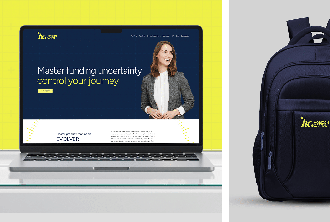
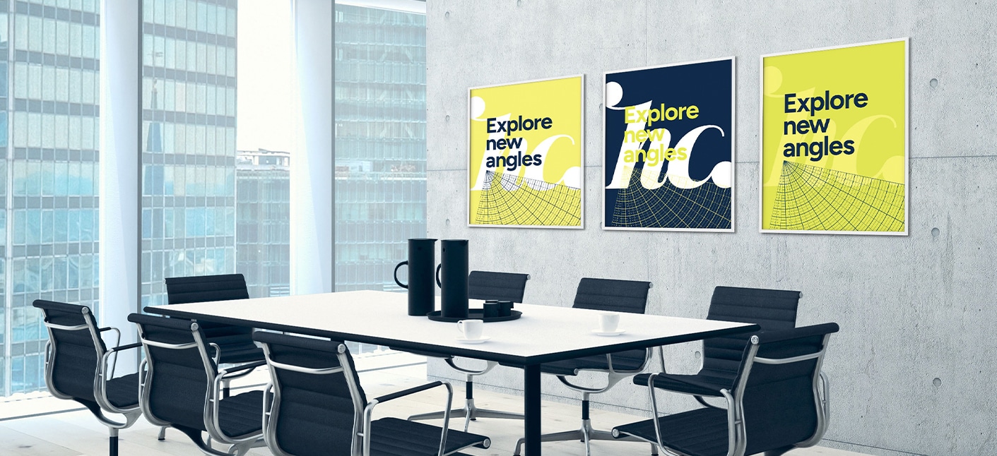
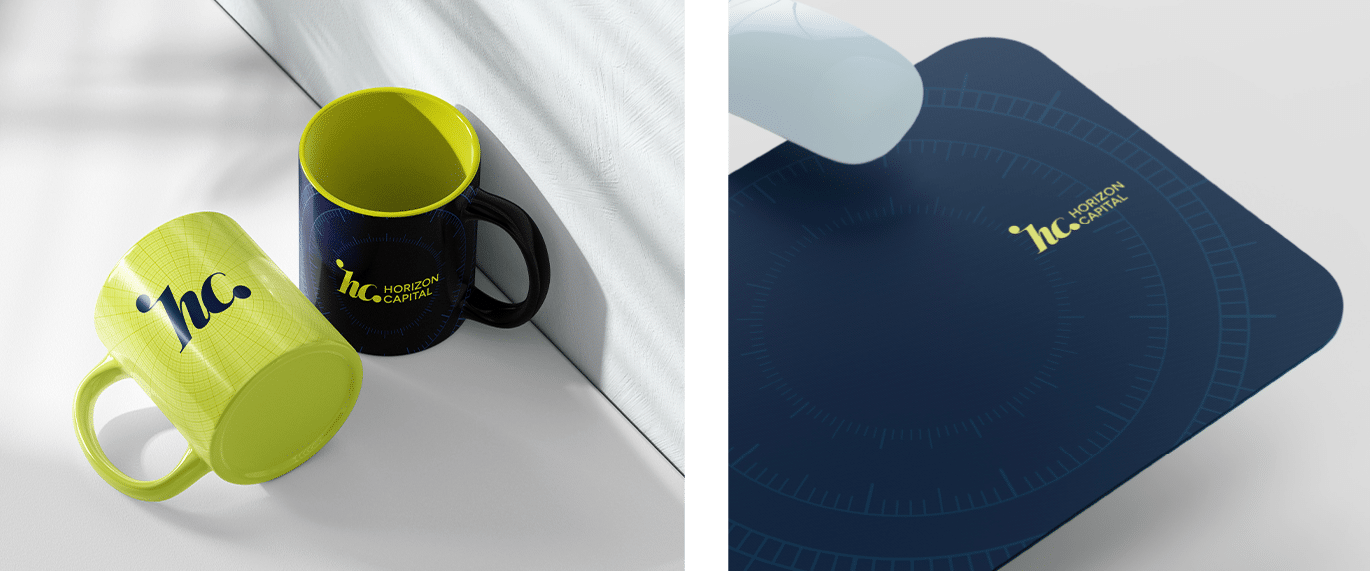
את אסטרטגיית המותג בנינו סביב האמונה המרכזית של Horizon: בין שתי נקודות תמיד קיים הנתיב האופטימלי, גם אם הוא לא הקצר ביותר. הפילוסופיה הזו קיבלה ביטוי בלוגו: האותיות HC זורמות בין שתי נקודות, ומייצגות את המסע המשותף עם חברות הסטארטאפ. השפה הוויזואלית בנויה על גרידים מדודים ודפוסים גיאומטריים שממחישים את הגישה השיטתית של הקרן, אך שומרים על תחושת תנועה והתקדמות מתמדת. פלטת הצבעים מאזנת בין ביזנס לחדשנות: גוונים קרירים של כחול מקצועי משתלבים עם ירוקים וצהובים רעננים שמסמלים את הדינמיקה והאנרגיה של חברות הפורטפוליו. כל אלמנט חזותי מחזק את הסיפור של Horizon: קרן שלא רק משקיעה הון, אלא מלווה את הסטארטאפים בדרך המדויקת ביותר להצלחה, גם כשהדרך הזו פחות צפויה.
-

Albarius / זהות מותג, אסטרטגיית מותג, לוגו, אתר
-
ASUS / פרסום, ניהול מותג, מסחרי, שיווק, סושיאל
-
DeeDee / זהות מותג, אסטרטגיית מותג, לוגו
-
ZOOMD / זהות מותג, אסטרטגיית מותג, מסחרי, מיתוג מחדש, אתר
-
מלח פלפל / זהות מותג, אסטרטגיית מותג, מסחרי, לוגו, שיווק, מיתוג מחדש
-
ארקיע / פרסום, זהות מותג, ניהול מותג, מסחרי, חֶברָתִי, אתר
-
פלורליס / פרסום, מסחרי, שיווק, סושיאל
-
גולדפרב גרוס זליגמן / זהות מותג, אסטרטגיית מותג, לוגו
-
קוקה קולה / פרסום, זהות מותג, אסטרטגיית מותג, מסחרי, שיווק
-
Kligler / זהות מותג, אסטרטגיית מותג, לוגו
-
7th Heaven / זהות מותג, אסטרטגיית מותג, לוגו
-
Hortus / זהות מותג, אסטרטגיית מותג, לוגו
-
elvy.ai / זהות מותג, אסטרטגיית מותג, לוגו
-
Better Sleep / מסחרי, שיווק, מיתוג מחדש, אתר
-
Beyond / זהות מותג, אסטרטגיית מותג, לוגו, סושיאל
-
Ananda / זהות מותג, אסטרטגיית מותג, לוגו
-
Access / זהות מותג, אסטרטגיית מותג, לוגו
-
Dish / זהות מותג, אסטרטגיית מותג, מסחרי, לוגו, סושיאל
-
Charging Robotics / זהות מותג, אסטרטגיית מותג, לוגו, שיווק, אתר
-
Bucket / זהות מותג, אסטרטגיית מותג, לוגו
-
איגוד הכדורסל הישראלי / זהות מותג, ניהול מותג, אסטרטגיית מותג, מסחרי, לוגו, שיווק, מיתוג מחדש, סושיאל
-
Apolicy.IO / זהות מותג, לוגו
-
חוות דעת / זהות מותג, ניהול מותג, אסטרטגיית מותג, לוגו, שיווק, חֶברָתִי, אתר